ShopDreamUp AI ArtDreamUp

Deviation Actions


![AT - Suoh [+video!]](https://images-wixmp-ed30a86b8c4ca887773594c2.wixmp.com/f/aae2c156-030a-4b11-bc73-2552b76c6edc/db6enzc-b0d0a560-0520-4763-a864-aa8d942c6f12.png/v1/crop/w_184,h_184,x_0,y_7,scl_0.034074074074074/at___suoh___video___by_nezupanda_db6enzc-92s-2x.png?token=eyJ0eXAiOiJKV1QiLCJhbGciOiJIUzI1NiJ9.eyJzdWIiOiJ1cm46YXBwOjdlMGQxODg5ODIyNjQzNzNhNWYwZDQxNWVhMGQyNmUwIiwiaXNzIjoidXJuOmFwcDo3ZTBkMTg4OTgyMjY0MzczYTVmMGQ0MTVlYTBkMjZlMCIsIm9iaiI6W1t7ImhlaWdodCI6Ijw9Njk3IiwicGF0aCI6IlwvZlwvYWFlMmMxNTYtMDMwYS00YjExLWJjNzMtMjU1MmI3NmM2ZWRjXC9kYjZlbnpjLWIwZDBhNTYwLTA1MjAtNDc2My1hODY0LWFhOGQ5NDJjNmYxMi5wbmciLCJ3aWR0aCI6Ijw9NjAwIn1dXSwiYXVkIjpbInVybjpzZXJ2aWNlOmltYWdlLm9wZXJhdGlvbnMiXX0.3kQyoXDeWS1kFj75v8mqtnUtI8RW3KQYlOn2x-vi8Eg)
![AT - Suoh [+video!]](https://images-wixmp-ed30a86b8c4ca887773594c2.wixmp.com/f/aae2c156-030a-4b11-bc73-2552b76c6edc/db6enzc-b0d0a560-0520-4763-a864-aa8d942c6f12.png/v1/crop/w_92,h_92,x_0,y_4,scl_0.017037037037037/at___suoh___video___by_nezupanda_db6enzc-92s.png?token=eyJ0eXAiOiJKV1QiLCJhbGciOiJIUzI1NiJ9.eyJzdWIiOiJ1cm46YXBwOjdlMGQxODg5ODIyNjQzNzNhNWYwZDQxNWVhMGQyNmUwIiwiaXNzIjoidXJuOmFwcDo3ZTBkMTg4OTgyMjY0MzczYTVmMGQ0MTVlYTBkMjZlMCIsIm9iaiI6W1t7ImhlaWdodCI6Ijw9Njk3IiwicGF0aCI6IlwvZlwvYWFlMmMxNTYtMDMwYS00YjExLWJjNzMtMjU1MmI3NmM2ZWRjXC9kYjZlbnpjLWIwZDBhNTYwLTA1MjAtNDc2My1hODY0LWFhOGQ5NDJjNmYxMi5wbmciLCJ3aWR0aCI6Ijw9NjAwIn1dXSwiYXVkIjpbInVybjpzZXJ2aWNlOmltYWdlLm9wZXJhdGlvbnMiXX0.3kQyoXDeWS1kFj75v8mqtnUtI8RW3KQYlOn2x-vi8Eg)


Description
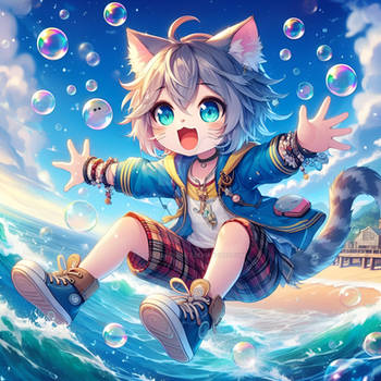
Drawing a cute boi callen Erin Yucie, he is an OC owned by x-Cute-Kitty-x,he also a closed species called Driftlings that belongs to x-Cute-Kitty-x
hhhh srsly he is so cute and when I draw him... people think that he is a girl lol, don't stare him too much he might be mad at you ~ (such a shy boi bby )
)
First I gonna say thanks to my friend 9Maple who already teach me about "water" in here, he is so kind and always help me, he also a good drawer too you guys should check his gallery
And I think I kinda missed some details (again), so please... any comment and criticism are so so much welcome cause I can't see the error in my drawing all by my self, I need someone who can point it out for my future reference :'>
_____
I also open commission, check in here: fav.me/dc3yb1c
hhhh srsly he is so cute and when I draw him... people think that he is a girl lol, don't stare him too much he might be mad at you ~ (such a shy boi bby
First I gonna say thanks to my friend 9Maple who already teach me about "water" in here, he is so kind and always help me, he also a good drawer too you guys should check his gallery
And I think I kinda missed some details (again), so please... any comment and criticism are so so much welcome cause I can't see the error in my drawing all by my self, I need someone who can point it out for my future reference :'>
_____
I also open commission, check in here: fav.me/dc3yb1c
Image size
2100x3000px 8.15 MB
© 2018 - 2024 Aya-DNA
Comments86
Join the community to add your comment. Already a deviant? Log In
Hello from 
Hi there! First of all, I have to say I really enjoy the very impressionnist look of this work! Now, let's do something constructive!
First of all, there is a bit of problems, I think, with your edges : while the colors themself are very painterly, some edges are very too strong for me. I might be wrong, but it makes it look like the different elements are as thin as paper. The best examble I see is the coat. if you add a darker edge on the side, it would give it some volume and it would feel thicker! Also, I think the characer is supposed to be in the watter, right? If yes, we should see some deformation and a edge around the place where the character enter in the water. it would make it a lot easier to read!
Now, for the composition, the biggest problem I see is the lack of focal element : everything seemsto have the exact same value : it is what we name "all over patern". It means, basicall, that there is the same amound of contrast/value/importance all around your composition. It makes it a lot harder to read. If you add a bit of athmospheric perspective to bright up the background but keep the same shades for your character, it would make it pop up instantantly. You could also add a rimlight around your character's shoulder to make it a bit more visible.
Finally, there is some semi-transparent glows all around the image and I'm really not sure of those. I think they are prety much useless and just make your work a bit weirder. Of course, it is just my vision of it. (Wink)")
You could also try to add a bit more details on the background to make it easier for the viewer to identify different elements.
Finally, may I ask you if you used layers on this. It almost lookslike you didn't and you tried to manually turn around some already painted stuff you did...
Hi there! First of all, I have to say I really enjoy the very impressionnist look of this work! Now, let's do something constructive!
First of all, there is a bit of problems, I think, with your edges : while the colors themself are very painterly, some edges are very too strong for me. I might be wrong, but it makes it look like the different elements are as thin as paper. The best examble I see is the coat. if you add a darker edge on the side, it would give it some volume and it would feel thicker! Also, I think the characer is supposed to be in the watter, right? If yes, we should see some deformation and a edge around the place where the character enter in the water. it would make it a lot easier to read!
Now, for the composition, the biggest problem I see is the lack of focal element : everything seemsto have the exact same value : it is what we name "all over patern". It means, basicall, that there is the same amound of contrast/value/importance all around your composition. It makes it a lot harder to read. If you add a bit of athmospheric perspective to bright up the background but keep the same shades for your character, it would make it pop up instantantly. You could also add a rimlight around your character's shoulder to make it a bit more visible.
Finally, there is some semi-transparent glows all around the image and I'm really not sure of those. I think they are prety much useless and just make your work a bit weirder. Of course, it is just my vision of it.
You could also try to add a bit more details on the background to make it easier for the viewer to identify different elements.
Finally, may I ask you if you used layers on this. It almost lookslike you didn't and you tried to manually turn around some already painted stuff you did...